
Page 163 - Math Course 1 (Book 2)
P. 163
Misleading Graphs
Accuracy of Predictions and Conclusions
Your Turn!
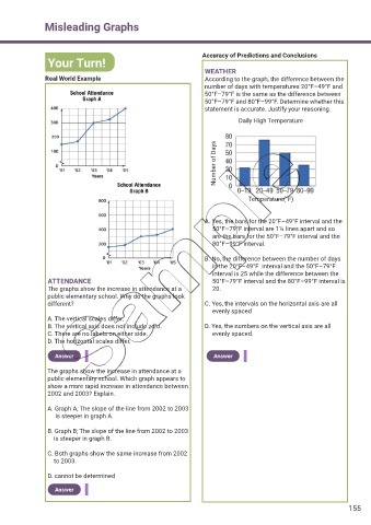
WEATHER
Real World Example According to the graph, the difference between the
number of days with temperatures 20°F–49°F and
50°F–79°F is the same as the difference between
50°F–79°F and 80°F–99°F. Determine whether this
statement is accurate. Justify your reasoning.
Daily High Temperature
Number of Days
Temperature(°F)
A. Yes, the bars for the 20°F–49°F interval and the
50°F–79°F interval are 1½ lines apart and so
are the bars for the 50°F–79°F interval and the
80°F–99°F interval.
B. No, the difference between the number of days
in the 20°F–49°F interval and the 50°F–79°F
interval is 25 while the difference between the
ATTENDANCE 50°F–79°F interval and the 80°F–99°F interval is
The graphs show the increase in attendance at a 20.
public elementary school. Why do the graphs look
different? C. Yes, the intervals on the horizontal axis are all
evenly spaced
A. The vertical scales differ.
B. The vertical axis does not include zero. D. Yes, the numbers on the vertical axis are all
C. There are no labels on either side. evenly spaced.
D. The horizontal scales differ.
Answer Answer
The graphs show the increase in attendance at a
public elementary school. Which graph appears to
show a more rapid increase in attendance between
2002 and 2003? Explain.
A. Graph A; The slope of the line from 2002 to 2003
is steeper in graph A.
B. Graph B; The slope of the line from 2002 to 2003
is steeper in graph B.
C. Both graphs show the same increase from 2002
to 2003.
D. cannot be determined
Answer
155