
Page 159 - Math Course 1 (Book 2)
P. 159
Data Graph
Mo. 11
Lesson 3
KEY CONCEPTS: MO. 11 - L3a
1. Select an appropriate display for a set of
data Selecting Display for a
Set of Data
Concept Summary Statistical Graphs
Display Best Time to Use
Bar Graph to display the frequency of data in categories
Box–and–Whisker Plot to divide a set of data into four parts using the median and quartiles.
Circle Graph to compare parts of the data to the whole
Frequency Table to compare the number of values in intervals
Histogram to display numerical data that has been organized into equal intervals
Line Graph to show change over a period of time
Line Plot to display how many times each number occurs in data
Stem–and–Leaf Plot to list all the data in a condensed form
Table to list data individually or by groups
Venn Diagram to display relationship among sets of data
Let’s Begin
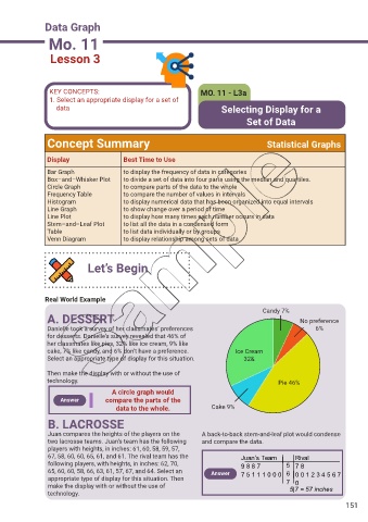
Real World Example
Candy 7%
A. DESSERT No preference
Danielle took a survey of her classmates’ preferences 6%
for desserts. Danielle’s survey revealed that 46% of
her classmates like pies, 32% like ice cream, 9% like
cake, 7% like candy, and 6% don’t have a preference. Ice Cream
Select an appropriate type of display for this situation. 32&
Then make the display with or without the use of
technology. Pie 46%
A circle graph would
Answer compare the parts of the
data to the whole. Cake 9%
B. LACROSSE
Juan compares the heights of the players on the A back-to-back stem-and-leaf plot would condense
two lacrosse teams. Juan’s team has the following and compare the data.
players with heights, in inches: 61, 60, 58, 59, 57,
67, 58, 60, 60, 65, 61, and 61. The rival team has the Juan’s Team Rival
following players, with heights, in inches: 62, 70, 9 8 8 7 5 7 8
65, 60, 60, 58, 66, 63, 61, 57, 67, and 64. Select an Answer 7 5 1 1 1 0 0 0 6 0 0 1 2 3 4 5 6 7
appropriate type of display for this situation. Then 7
0
make the display with or without the use of 5|7 = 57 inches
technology.
151