
Page 119 - Math Course 1 (Book 1)
P. 119
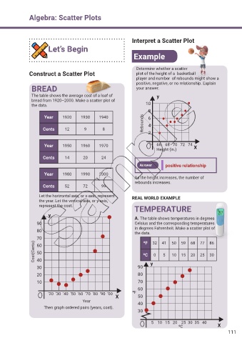
Algebra: Scatter Plots


                                                                  Interpret a Scatter Plot

                         Let’s Begin
                                                                   Example


                                                                    Determine whether a scatter
               Construct a Scatter Plot                             plot of the height of a  basketball
                                                                    player and number  of rebounds might show a
                                                                    positive, negative, or no relationship. Explain
                 BREAD                                              your answer.

                 The table shows the average cost of a loaf of                y
                 bread from 1920–2000. Make a scatter plot of
                 the data.                                               10
                                                                          8
                       Year     1920     1930     1940                    6


                      Cents      12       9        8                   Rebounds  4
                                                                          2


                       Year     1950     1960     1970                        66    68   70   72   74
                                                                              Height (in.)      X

                      Cents      14       20       24
                                                                      Answer      positive relationship

                       Year     1980     1990     2000
                                                                   As the height increases, the number of
                                                                   rebounds increases.
                      Cents      52       72       99

                    Let the horizontal axis, or x-axis, represent   REAL WORLD EXAMPLE
                    the year. Let the vertical axis, or y-axis,
                    represent the cost.
                                                                   TEMPERATURE
                         y
                                                                   A. The table shows temperatures in degrees
                   90                                              Celsius and the corresponding temperatures
                                                                   in degrees Fahrenheit. Make a scatter plot of
                   80
                                                                   the data.
                   70                                                   0F  32   41  50   59   68  77   86
                  Cost(Cents)  60                                       0C   0   5   10   15   20  25   30

                   50
                   40
                   30                                                90    y

                   20                                                80
                   10                                                70
                                                                     60
                         ‘20  ‘30  ‘40  ‘50  ‘60  ‘70  ‘80  ‘90  ‘00  0F
                                                          X          50
                                          Year
                                                                     40
                       Then graph ordered pairs (years, cost).
                                                                     30

                                                                            5    10   15   20    25  30  35   40
                                                                                         0C                 X
                                                                                                                 111