
Page 120 - Math Course 1 (Book 1)
P. 120
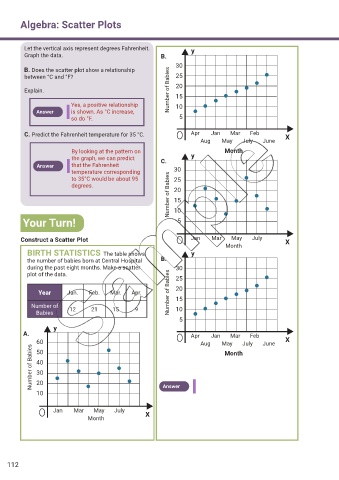
Algebra: Scatter Plots


          Let the vertical axis represent degrees Fahrenheit.       y
          Graph the data.                                 B.

                                                               30
          B. Does the scatter plot show a relationship
          between °C and °F?                                   25

          Explain.                                          Number of Babies  20
                                                               15
                          Yes, a positive relationship         10
              Answer      is shown. As °C increase,
                          so do °F.                             5


          C. Predict the Fahrenheit temperature for 35 °C.          Apr        Jan       Mar       Feb  X
                                                                       Aug        May       July       June
                          By looking at the pattern on                          Month
                          the graph, we can predict       C.        y
              Answer      that the Fahrenheit
                          temperature corresponding           30
                                                            Number of Babies  15
                          to 35°C would be about 95           25
                          degrees.                            20


         Your Turn!                                           10
                                                               5


        Construct a Scatter Plot                                    Jan        Mar       May       July  X
                                                                                Month
           BIRTH STATISTICS  The table shows                        y
           the number of babies born at Central Hospital   B.
           during the past eight months. Make a scatter        30
           plot of the data.                                   25


               Year      Jan.   Feb.    Mar.   Apr.         Number of Babies  20
                                                               15
            Number of    12      21      15     9              10
              Babies
                                                                5
                    y
         A.                                                         Apr        Jan       Mar       Feb
              60                                                       Aug        May       July       June  X
            Number of Babies  40
              50
                                                                                Month

              30
              20
              10                                          Answer


                    Jan        Mar       May       July
                                Month               X


    112